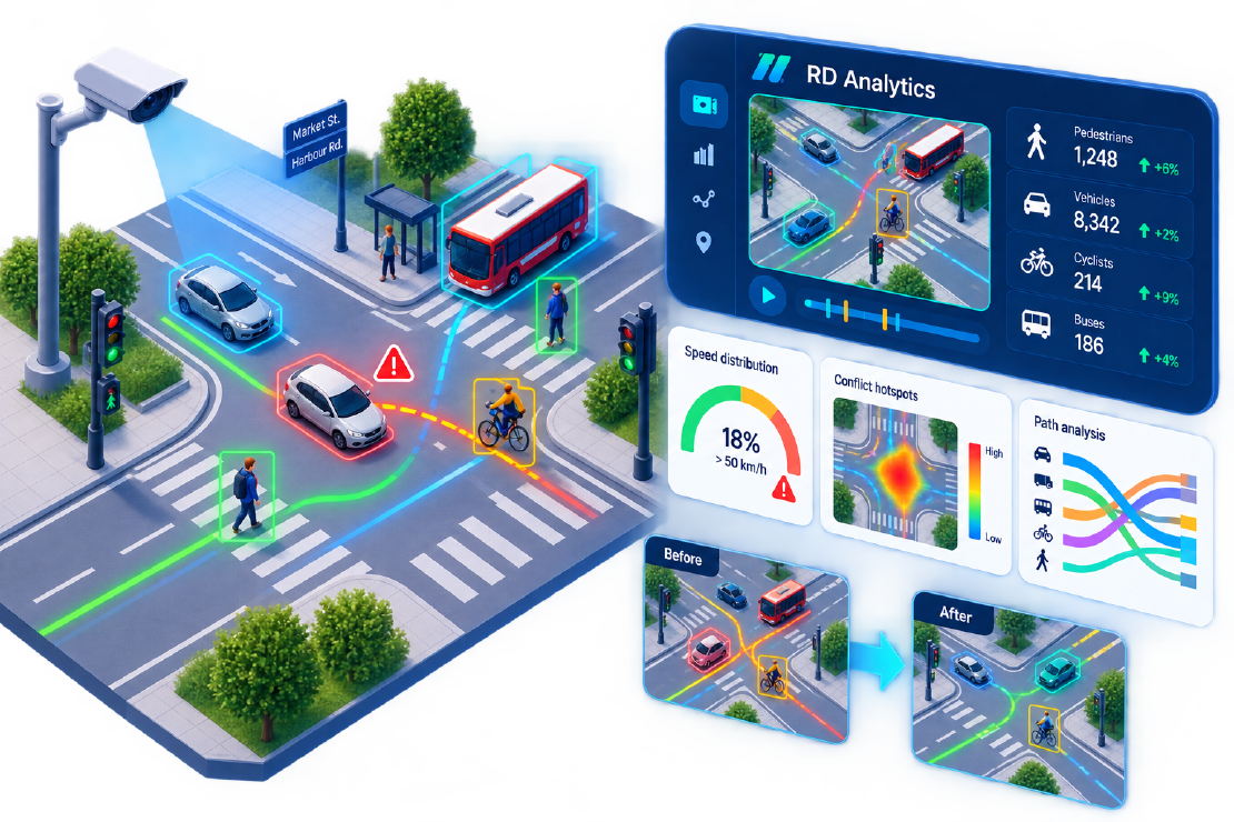
Crash maps are a poor safety brief. A four-leg signalised junction can show only a handful of injury collisions over several years and still generate complaints: near-misses for cyclists, parents avoiding the crossing, buses losing time in unpredictable queues. Cities often have peak turning counts—and almost no evidence of conflicts and behaviour between crashes.
This article shows how a traffic team can use RD Analytics to quantify that risk, inform a modest redesign, and measure change with the same geometry. The workflow is location → source → scan → report. The site type is the one we see most often: mixed retail and residential, existing CCTV, and no budget for weeks of manual conflict observation.
The typical brief
| Factor | What you usually have |
|---|---|
| Site | Four-leg signalised junction |
| Available data | Peak TMCs from a previous year; sparse crash records |
| Complaints | Pedestrian delay, left-hook risk for cyclists, PM spillback |
| Constraint | No multi-week roadside conflict survey |
| Cameras | Existing CCTV on some legs; one blind approach |
A geometric safety audit can tick boxes. It still cannot answer: how often do road users come into conflict, and at what speeds?
Approach
Phase 1 — Capture (about one week)
- Continuous daytime recording on the CCTV you already have
- One temporary camera only where CCTV is blind (often a cycle-lane conflict point)
- Optional short drone flights in the AM peak for bird’s-eye paths on a wide approach
- Files batched to an on-premise RD Analytics server when IT requires video to stay on the municipal network
Phase 2 — Analyse
Create one Location for the junction, attach sources, and configure Scans:
- Counting lines on each approach and the pedestrian crossings
- Density zones on the busiest waiting area
- Speed segments on the approach with speeding complaints
- Class groups mapped to local labels (Car, LGV, HGV, Bus, Cycle, Pedestrian)
Processing runs on GPU. Reports combine quantity by class, crossing events, average section speed, and entry→exit path pivots for the main turns.
Phase 3 — Diagnose
Video typically surfaces what crash history misses. Look for patterns such as:
- Pedestrian exposure — Crossing volumes aligned with bus arrivals; wait density spikes when the pedestrian stage is skipped under vehicle priority.
- Speed vs presence — Overspeed on an approach in the hour before school start, when pedestrian numbers are also high.
- Left-hook clustering — Dense car→cycle path interactions on a saturated green; a drone or extra camera view confirms tight gaps.
- Spillback — Occupancy on one approach exceeding a practical threshold many times in the PM peak, lining up with bus headway failures.
None of these require waiting for another injury crash to “prove” the problem.
A modest intervention set
Most sites do not need a full rebuild. Typical measures informed by this evidence:
- Leading pedestrian interval on the heavy crossing
- Protected-permissive adjustment for the conflicted left
- Approach speed feedback and refreshed markings
- Bus-hold logic review tied to occupancy thresholds (operations)
Write the evaluation metrics before you process video so the after-wave is comparable.
Measuring change (reuse the same geometry)
Reapply the same scan geometries to new recordings after the scheme is in. That is an underrated advantage of video versus remobilising manual teams.
| What to compare | Why it matters |
|---|---|
| Pedestrian crossing counts in the same demand window | Did the crossing feel usable, or did demand simply vanish? |
| Share of tracks above the posted speed | Speed was the exposure you could actually change |
| Close-path / conflict-style index on the problem turn | Behaviour, not only volumes |
| High-occupancy events on the spillback approach | Queue management and bus reliability |
| Bus schedule adherence (operator sample) | Outcome the public notices |
Use anonymised charts and scene overviews from RD Analytics reports for public communication—not raw faces. CSV/Excel exports support the evaluation memo; the Data API can feed an internal dashboard for the transport committee.
What makes the method stick
- Same tool for volumes, speeds, and paths — One platform, one method statement.
- Replayable evidence — Timeline review settles disputes in design workshops.
- Reusable geometry — Before/after uses identical lines and zones.
- On-prem control — Recognition stays on hardware the city already governs.
- Multimodal by default — Pedestrians and cyclists are not a second contract.
Lessons for the next junction
- Sparse crash history is not proof of safety; it is proof of rare reporting.
- Start with cameras you already have; add one temporary view only where CCTV is blind.
- Keep class groups aligned with how elected officials talk (“buses”, not model class IDs).
- Budget for a second survey wave; that is where video ROI appears.
Next step
If a scheme is about to be signed off on geometry and old TMCs alone, run a two-week video diagnostic first. RD Analytics turns existing footage into the counts, speeds, and path evidence a safety case actually needs.
Related reading: speed and incident-style analytics, top use cases, smart-city integration.